Variant Picker
This block displays available product options (e.g. Color or Size) with selectable variants.
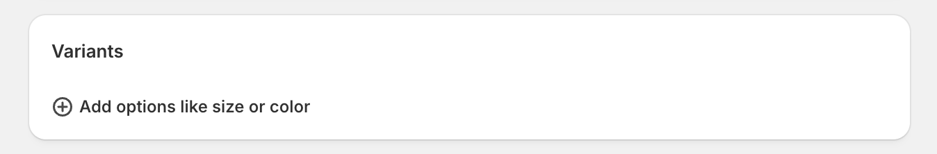
Create a variant
- Go to the product to which you want to add a new variant.
-
Find the Variants block and click Add options like size or color if you're adding variants for the first time.
- Add the Option name (e.g. Color, Size, Material).
- Add Option values (e.g. XS, S, M, L, XL, 1X).
- Click Done.

Frame

Set up block
- Select a Product Template to edit from the dropdown menu in the top bar.
- Click the Variant picker block to open its settings.
- If the Variant picker block doesn’t exist, go to the side panel. Under the Product page section, click + Add block and select the Variant picker block.
- Select the Type option you desire. Frame offers two options: buttons and dropdowns.
-
Buttons: Variants display as 'chips' or clickable rectangles.

-
Dropdowns: Variants display as a dropdown list selector.

Most customers prefer color swatches to be shown as buttons, and this is the default. However, if you have dozens of colors you may prefer the dropdown.
-
- Check Show color swatches to display your product variants as a row of clickable color swatches. To learn how to set-up color swatches, please refer to the color swatches article.
- Check Show low stock notification to display a notification when the selected variant has 5 or fewer items in stock. Please ensure you have inventory tracking enabled.
- Click Save.
Frame, Madison.
Honey

Set up block
- Select a Product Template to edit from the dropdown menu in the top bar.
- Click the Variant picker block to open its settings.
- If the Variant picker block doesn’t exist, go to the side panel. Under the Product page section, click + Add block and select the Variant picker block.
- Select the Variant picker type you desire. Honey offers two options: Buttons and Dropdowns.
-
Buttons: Variants display as 'chips' or clickable rectangles.

-
Dropdowns: Variants display as a dropdown list selector.


-


Most customers prefer color swatches to be shown as buttons, and this is the default. However, if you have dozens of colors you may prefer the dropdown.
- Select the Swatch type you desire. Honey offers tree options: Default, Swatches, and Variant images.
- Default: This setting takes the option you selected in the previous step: Buttons or Dropdowns.
-
Swatches: This option will display clickable swatches. You can use the default system colors or custom images. To learn more, please refer to the color swatches article.

-
Variant images: This option will display the variant images you selected for each product variant. To learn more, please refer to the color swatches article.

- Select the Swatch shape you desire.
-
Circle

- Square
- This shape will take the border radius setting you selected under Theme Settings > Styles > Border Radius

- Rectangle
- This shape will take the border radius setting you selected under Theme Settings > Styles > Border Radius

-
- If desired, use the slider to change the Swatch size.
- Click Save.


Honey, Noteable, Maravella, Roadster, Treasure.
According to the Baymard Institute, buttons almost always outperform dropdown menus.
“[With a dropdown menu,] users must check to see if their size is available for each variation under consideration — a potentially tedious task that often leads to users simply giving up....exposed “Buttons” allow users to immediately see size options.”
-Baymard Institute
With buttons, all options are shown up front, which is less work for the user, which then results in a higher conversion rate. For this reason, we use buttons as the default variant picker on our themes and we highly recommend that you do not change it. However, for those merchants with dozens of SKU variations, you may want the option of the traditional dropdown menu.
Filter gallery by color
Our themes provide the option to filter the product images displayed in the gallery based on the selected variant. This feature is ideal for merchants with many images per color. To filter the gallery by color, please follow these steps:
- In the Theme editor, go to Products and select a Product Template to edit from the dropdown menu in the top bar.
- Click the Product page section to open its settings.
- If enabled, uncheck Show images of all colors regardless of variant selected.
- Navigate to your Shopify admin.
- Go to the product you want to filter images by color.
- Find the Media block and click on one of the product images to open its settings.
- Click Add alt text and type the color name exactly as it appears on your variant in parentheses. For example, if your color variant is Heather Gray, type the alt text as
(Heather Gray).- If you don’t add any alt text, the image will be displayed for all color variants.
- You may add additional alternative text outside of the parentheses. You may want to describe the image for accessibility purposes. For example, Long Dress with Short Sleeves (Black).
- Click Save alt text.
- Add a featured image to every variant in the Product Admin.
- Click Save.

Our themes offer the option to filter thumbnails by any custom option such as Fit, Material, or Style. For instructions on setting up custom options please visit Custom Variant Swatches.